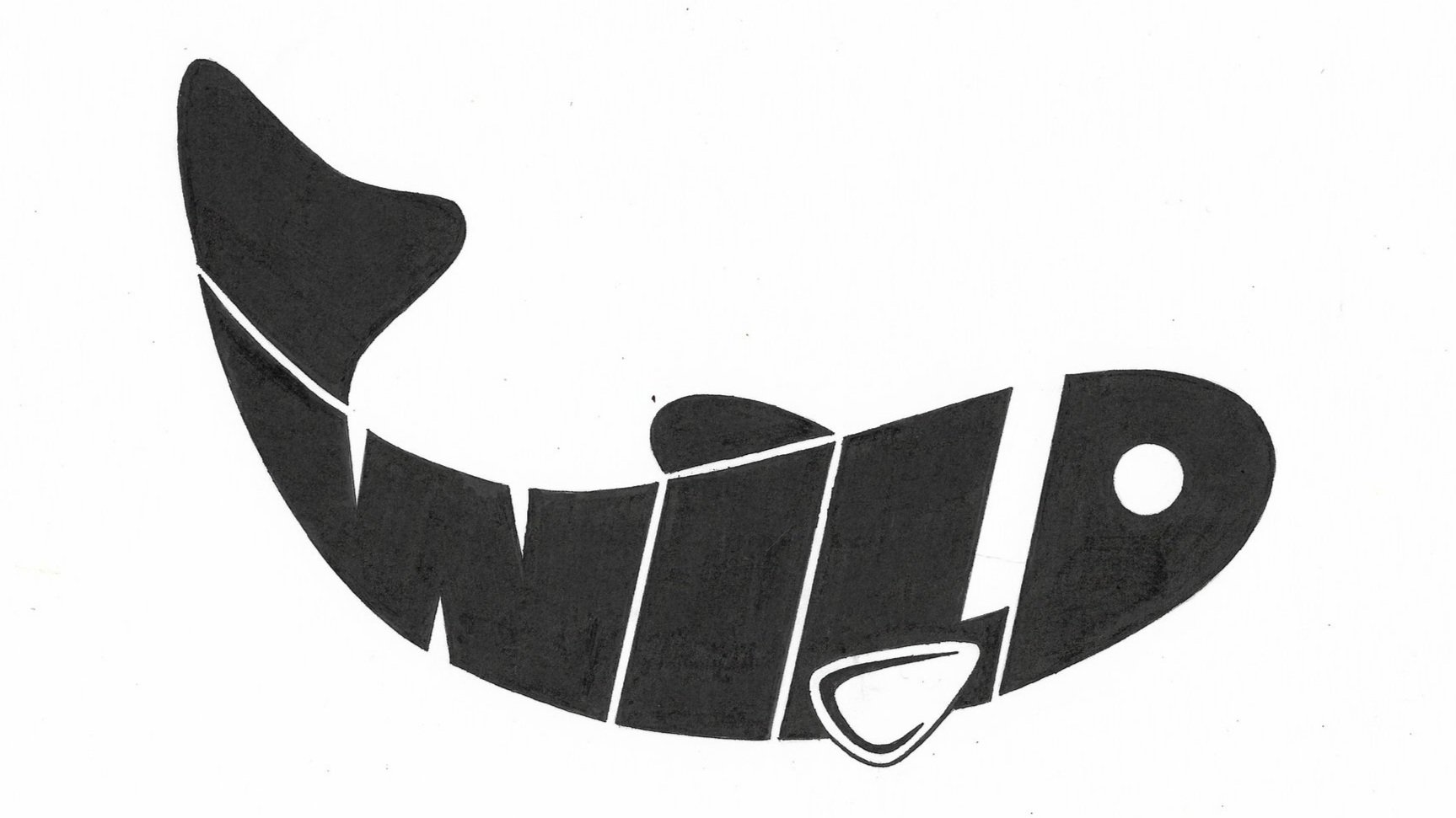
Wildfish logotype
A very simple hand-drawn logotype which I designed in an intro GRDS class at SCAD at the beginning of my official graphic design education - I debated whether or not to include this in my portfolio, but I feel that I captured my process very well and this showcases how I ideate. I also love the simplicity of this design and how well it works.
Illustration // Graphic Design // BrandingFinal Result
Design Process
I had a lot of fun with this design. The fish idea came to me after looking at the word written in all caps and thinking, “I can do something with that D at the end, but what?”. Then I pictured a fish head and was excited about the prospect of turning the entire word into a fish body. I’m so grateful for the feedback that I received (overall, but especially on this design) – giving the fish some movement and closing the spaces between the letters really took this design to the next level. During this project, I realized the importance of exhausting every avenue regarding designs and getting all ideas down on paper. These may not have all been winners, but each design helped me remove any creative blocks that I have and helped propel me into the next designs.
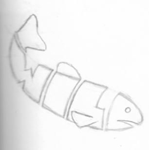
Refined rough sketch.
Based on my original design, I had my heart set on a font that was bold and wouldn’t detract from the fish shape. I needed it to fill the space well and provide a nice body for the fish.
The font I ended up going with is called New Machines and is highlighted in yellow.
I like this font because it is bold, thick and the letters spaced close together.
I ended adjusting letters In Adobe Illustrator in order to get them to fit the confines of my fish shape. I also made the “ILD” more slanted so that there wasn’t as big of a gap between the “I” and “W”.
I also took some artistic liberties with the “D” so that the fish head was more appealing and went with the design.
I decided to remove the mouth of the fish because I received some feedback that the “D” looked like an “e”.
I enlarged the eye because it’s more appealing and helps the design flow more easily.
I thought of using these shapes to incorporate the fin into the black of the text, but ended up just closing the shape.
Still felt that it was missing something, so I included this curved shape to add a little interest and dimension.
Here’s a layout of my (nearly) complete design process. I scanned my drawing into Adobe Illustrator and put the text over it. Then I altered the text to make sure that it would fit inside my fish shape. From there, I printed out the text, traced with tracing paper twice (because the image was inverted) and then transferred it to the Bristol paper. Finally, I filled everything in with black ink extremely carefully.


